
Astrae Oratio Art Director: "Why the 89 Tokyo Setting?"
아스트라에 오라티오 아트디렉터 "89년 도쿄 배경 이유는"
2026.08.24 15:06 UTC+9

AI Summary
NC revealed new details about Astraea Oratio, its upcoming urban fantasy subculture title.
Dynamis One Art Director Kim In explained the unique choice of a fictional 89 Tokyo setting.
The game combines magic, shin-denki, and administrative elements under a lyrical analogue theme.
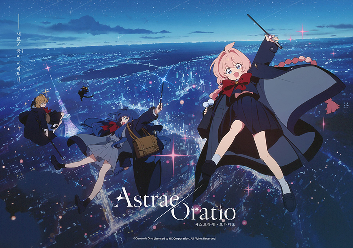
NC's upcoming subculture title, Astraea Oratio, takes us back to a fictional 89 Tokyo. That rather unusual time period has set tongues wagging, and Dynamis One Art Director Kim In recently stepped up to explain just why the team chose this exact era.
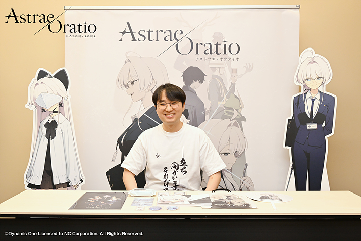
Astraea Oratio made an appearance at Comic Market held at Tokyo Big Sight from the 15th to the 16th. Through an interview with Dynamis One Art Director Kim In, NC pulled back the curtain to reveal some juicy details about the game.
As mentioned earlier, this game is staged in a fictional 89 Tokyo. It leans heavily into the shin-denki genre where daily life, magic, and bizarre occurrences happily collide, tasking players with stepping into the shoes of a magic ministry civil officer crossing paths with a colourful cast of characters. Shin-denki is a sub-genre of urban fantasy birthed in Japan, defined by supernatural elements bleeding into the modern world. It enjoyed a massive wave of popularity spanning from the 90s to the early-to-mid 2000s, boasting heavyweight titles like The Garden of Sinners, Shakugan no Shana, and the Persona series.
When asked why the developers settled on 89 Tokyo as the canvas, Art Director Kim In noted, "Since we are dealing with shin-denki and magic as our themes, we figured Japan and Tokyo naturally had to take centre stage." They added, "The market is already overflowing with titles set in the near future and Western locales. So, we wanted to try something a bit different and tackle 'nostalgia'."
The core pillars of Astraea Oratio are magic, shin-denki, and administration. First off, magic manifests in ways that slip right past ordinary citizens, injecting strange anomalies into mundane routines. Art Director Kim In explained, "Picture a house overgrown with thickets wedged tightly between towering office blocks, or a witch-costumed character standing right in the middle of a bustling crowd while everyone just carries on. We want to kick off and expand the world from those light-hearted, 'Wait, how on earth did that get there?' kind of curiosities."
Moving on to shin-denki, the team leans heavily into a chilling aesthetic. Art Director Kim In elaborated, "We felt shin-denki carries a stronger vibe of winter rather than summer, built on a sharp contrast between day and night. To capture that crisp winter air, we anchored our palette around cool blues." They continued, "We balanced it out by weaving in spring pinks and greens to stop things from getting too gloomy."
Finally, administration was roped in to give the magic a distinct flavour of its own. Art Director Kim In mentioned, "We are pouring our focus into maps and landmark designs that scream bureaucracy. On top of that, we are layering in analogue props like neatly pressed suits, crisp paperwork, ID cards, stamps, nameplates, and business cards to truly nail that official governmental vibe."
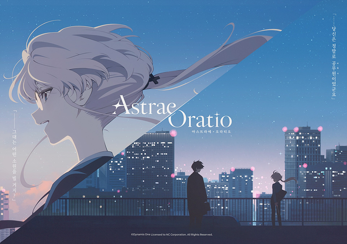
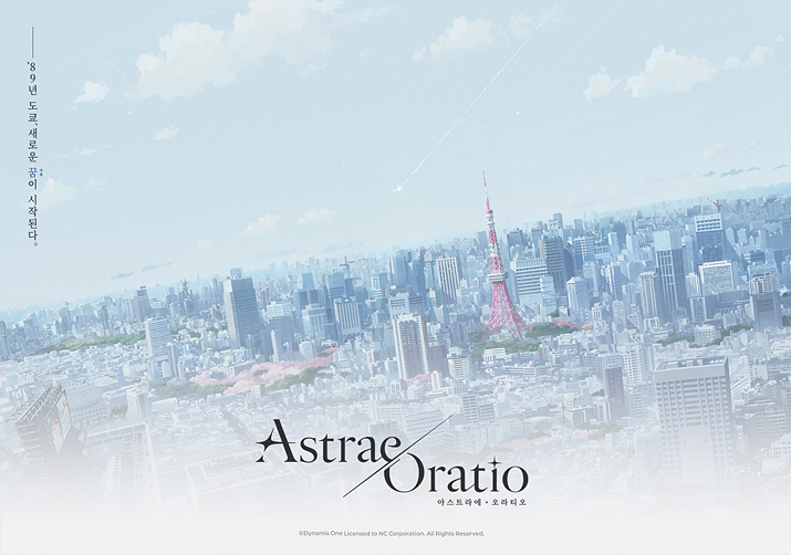
Another driving keyword is 'lyrical analogue'. Art Director Kim In stated, "We wanted to directly inherit the texture of the era when shin-denki was all the rage. We racked our brains on how to make such a well-trodden trope feel fresh and new, but eventually concluded that instead of aggressively twisting the material, it is far better to lean into the classic charm the genre naturally owns. We reckon analogue is simply the best vessel to capture that classic essence."
They also mentioned falling head over heels for the lyrical emotional depth woven into the prologue by scenario director isakusan, which ultimately tied the whole concept together into the core keyword 'lyrical analogue'. Meanwhile, the overall art direction and foundational tone were helmed by DoReMi, with feev99 taking charge of the backgrounds.
Art Director Kim In added, "We are grafting that lyrical analogue philosophy onto visuals tailored for modern sensibilities." They also shared, "For real-world locations featured in Astraea Oratio like the Rainbow Bridge and Tokyo Tower, we are dialling up the authenticity through extensive on-site field research. The central district of Minato was scouted on foot several times over."
As touched upon earlier, Astraea Oratio rolled up to Comic Market and showcased a teaser art book at the venue. Art Director Kim In noted, "It was originally crafted as a guide to synchronise understanding among fellow developers and collaborating departments. Once we started properly teasing the game, we thought it would be lovely to share it with the fans too," adding, "We hope you enjoy it as a bite-sized introduction to the world and characters before the main narrative of Astraea Oratio unfolds."
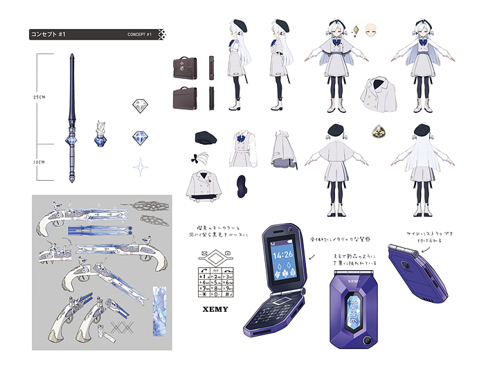
엔씨가 서비스하는 서브컬처 신작 '아스트라에 오라티오'는 가상의 89년 도쿄를 배경으로 삼는다. 흔치 않은 시대적 배경 설정에 대해 다양한 의견이 오갔는데, 디나미스 원 김인 아트 디렉터가 시대적 배경을 이때로 설정한 이유를 밝혀 눈길을 끌었다.
아스트라에 오라티오는 지난 15일부터 16일까지 도쿄 빅사이트에서 개최된 코믹마켓에 참가했다. 엔씨는 디나미스 원 김인 아트 디렉터와의 인터뷰를 통해 게임에 대한 구체적인 내용을 공개했다.
앞서 밝혔듯이 이 게임은 가상의 89년 도쿄를 무대로 삼는다. 일상, 마법, 기묘한 사건이 공존하는 신전기 장르를 표방하며, 마법 관련 부처 소속 공무원이 되어 여러 인물과 만나며 벌어지는 일을 다룬다. 신전기는 일본에서 비롯된 어반 판타지 하위 장르로, 현대에 침범한 초자연적인 요소가 특징이다. 90년대부터 2000년대 초중반까지 인기를 끌었고, 대표작으로 공의 경계, 작안의 샤나, 페르소나 시리즈 등이 있다.
게임 속 배경을 89년 도쿄로 설정한 이유에 대해 김인 아트 디렉터는 "신전기와 마법을 테마로 하는 만큼, 일본과 도쿄라는 공간이 중심 무대가 될 수 있다고 생각했다"라며 "시장에는 근미래와 서양을 배경으로 하는 많은 작품이 존재한다. 그래서 색다른 시도로 '노스탤지어'를 다뤄보고 싶었다"라고 말했다.
아스트라에 오라티오의 핵심 테마는 마법, 신전기, 행정이다. 우선 마법은 시민들이 눈치채지 못하는 방식으로 일상에 이질적인 무언가가 섞이는 형태로 표현된다. 김인 아트 디렉터는 "빌딩 사이에 수풀이 우거진 집이 끼어 있다거나, 군중 사이에 마녀 복장 캐릭터가 서 있는데 시민들은 눈치채지 못하는 식이다. '이게 어떻게 된 일이지?'와 같은 궁금증을 줄 수 있는 가벼운 재미에서 세계를 시작하고 확장하려 한다"라고 밝혔다.
이어서 신전기에 대해서는 차가운 이미지를 강조한다. 김인 아트 디렉터는 "신전기의 이미지는 여름보다 겨울, 낮과 밤의 대비라는 인식이 강했다. 그래서 겨울의 차가운 공기를 전달하도록 청색을 중심으로 잡았다"라며 "너무 어두워지지 않도록 봄의 분홍색과 녹색을 섞어 밸런스를 맞췄다"라고 설명했다.
마지막으로 행정은 마법에 고유한 특색을 더할 소재로 채택됐다. 김인 아트 디렉터는 "행정을 나타낼 수 있는 지도와 랜드마크 표현에 집중하고 있다. 이외에도 정장, 서류의 정갈함이나 ID 카드, 도장, 명패, 명함 등 아날로그 소품을 더해 관료 체계 감성을 전달하고자 했다"라고 언급했다.
또 다른 키워드는 '서정적 아날로그'다. 김인 아트 디렉터는 "신전기가 유행했던 시대의 질감을 그대로 가져오고자 했다. 많이 다뤄진 소재를 새롭고 신선하게 전하기 위해 고민했으나, 억지로 소재를 비틀기보다 장르가 가진 클래식한 매력을 살리는 게 좋겠다고 결론을 내렸다. 그 클래식함을 가장 잘 담아낼 수 있는 표현이 아날로그라고 생각한다"라고 전했다.
여기에 이사쿠상(isakusan) 시나리오 디렉터가 쓴 프롤로그의 서정적인 감성에 큰 매력을 느껴, 이를 아날로그와 묶어 '서정적 아날로그'를 핵심 키워드로 설정했다고 말했다. 전반적인 화풍 설계와 기조는 도레미(DoReMi)가 맡았고, 배경은 피브99(feev99)가 담당했다.
김인 아트 디렉터는 "서정적 아날로그를 중심으로 현재 트렌드에 맞는 비주얼을 선보이기 위해 노력 중이다"라며 "아스트라에 오라티오에 노출되는 실제 지역과 레인보우 브릿지, 도쿄 타워 등을 바탕으로 한 비주얼의 경우 현지 취재로 완성도를 높이고 있다. 이야기 중심이 되는 미나토구는 도보로 몇 번 취재하기도 했다"라고 덧붙였다.
앞서 밝혔듯이 아스트라에 오라티오는 코믹마켓에 참여했고, 현장에서 티저 아트북을 선보였다. 김인 아트 디렉터는 "동료 개발자 및 협업 부서와의 인식 동기화를 위해 만든 가이드북이었다. 본격적인 게임 티징 후 팬에게도 공유하고 싶다는 생각이 들어 아트북을 마련했다"라며 "아스트라에 오라티오 서사가 전개되기 전에 가볍게 세계와 캐릭터에 대해 이해할 수 있는 요소로 즐겨주시길 바란다"라고 말했다.
This news was translated by AI.
Let's not lose our initial resolve. Meticulously, one by one. risell@gamemeca.com
READ MORE
RECOMMENDED NEWS
MOST POPULAR NEWS
- [Today's steam] Aion 2 Records 400,000 Concurrent Players Upon Official Launch
- Is something big coming? Nikke 4th Anniversary Special Broadcast to air on the 24th at 7 PM
- "Cannot even log in" Steam blockades intensify in Vietnam
- Representative Cho Seung-rae: "Gamescom's Strength is Strong B2B, Desperately Needed for G-Star"
- Pre-load starts for World of Dokkaebi, releasing on October 8
- "Destined to Disappear Anyway" CyberConnect2 CEO Supports Abolishing Physical Discs
- [Cartoon] The arrival of the sharpshooter 'Aion 2'?
- NieR, Diablo, and more: Dead by Daylight collaboration skins released in succession
- 'Dave the Diver' Complete Edition Released with All Expansions
- Dokkaebi World Achieves Number 1 Popularity on Both Major App Markets on Launch Day
MEDIA PARTNERSHIPS



GAMEMECA SNS


 GAMEMECA GLOBAL SITE